Amway New Look Design Preface
Project Category:
Amway eCommerce
Client:
Amway Corp., Ada, MI
Design Technology Used:
Adobe Illustrator & Sketch
Release Date:
Potential for future evaluation
Project Overview:
Amway is a global commerce business that requires a design structure solution for complex views across three different usage paradigms.
Problem/Challenge:
The global stature illuminated many issues where the blurring of localization, diverse information options, connected device interaction, and the Internet-of-Things (IoT), made it difficult to design an all-encompassing approach. The design complexity of site page layout, mobile simplicity, and bubble-up to dashboard was a complicated problem.
Solution/Results:
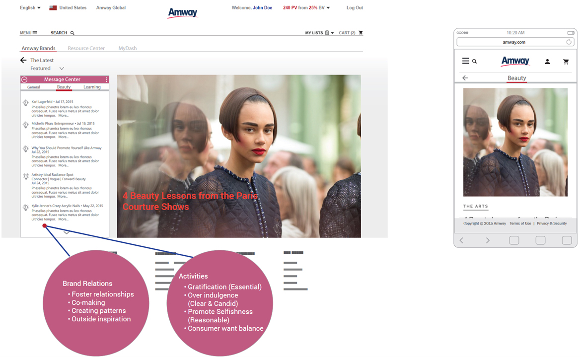
The implementation of a tiles/cards metaphor provided a content connection to real-life objects. This usage provided a better way to gather various pieces of information to form one coherent piece of content. The design offered ways for commerce product contact and navigation to co-exist. As established in the UX industry, card-based design relies on visuals. Imagery elevates site or app design, because images draw the user’s eye effectively and immediately to the content. Employing images makes card-based design more attractive to users.
Typography & Visual Color Pattern:
The typography and visual design elements in the wireframe views are consistent with Amway established corporate design guideline policy.
The Road Map:
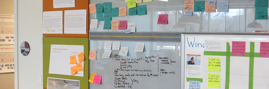
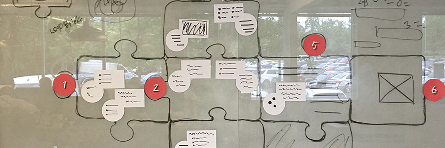
A card design was purposed because it allowed flexibility to examine how cards can function across site, app design, and dashboard; the three distinct usage requirements. The architectural balance between digestible forms and navigation appear in a stream, creating a natural timeline of events for users to understand. In an effort to establish a basis for the design, several white-board discussions outlined the proposition for a working theory. An assertion that the design had to consist of a series of components, rather it was a puzzle that had to be assembled.
At the basic functional level, navigation was critical for users to understand how to engage with the product. First, it had to be simple, much like an invisible hand that could guide users. Next, graphic sign-post had to be easy to remember, to minimize the user’s memory load by making actions and options visible. Also, the navigation had to be intuitive and effortlessly guide the user from point A to point B at a glance. Finally, it was necessary for users to engage and interact with the content in the view.
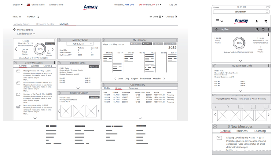
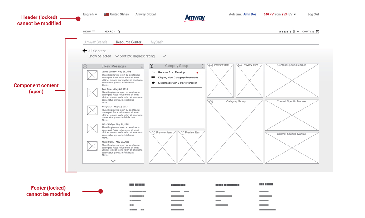
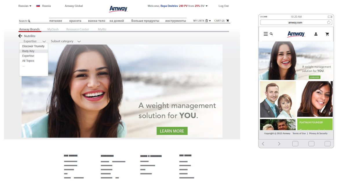
Windows emergence was the precursor to designing from a mobile-first ideology. A lot of design-thinking went into the creation of regional collaboration product-level mind maps, along with customer journey maps outlining each region’s priorities. The big take-away from these design exercises were that Amway reseller users used their mobile devices in agile ways to purchase products. Also, product managers began to think outside their own comfort zone to begin the awareness about the “how-to” of transitioning their merchandising components. The design achieved its objective of moving product management and executive staff in the right direction toward the future of mobile commerce. Implementing a Windows user interface that featured square or rectangular tiles provided a visual card system. The use of cards allowed static content, as well as video content, to present a more complete picture of product strategy implementation.