Amway Artistry New Look Possibilities
Project Category:
Amway eCommerce
Client:
Amway Corp., Ada, MI
Design Technology Used:
Adobe Illustrator & Sketch
Release Date:
Concept for future evaluation
Project Overview:
Amway is a global commerce business that requires a design structure solution for complex views across three different usage paradigms.
Problem/Challenge:
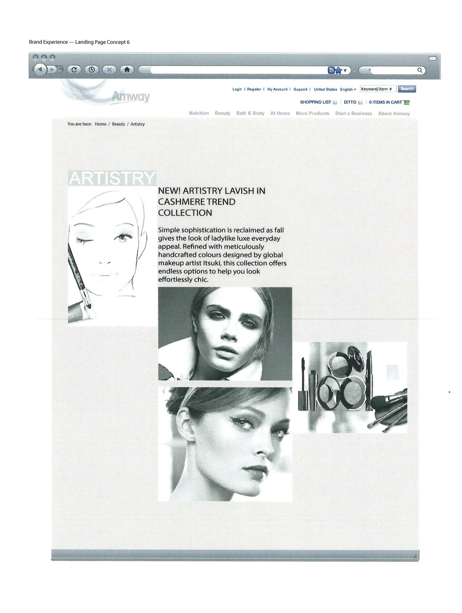
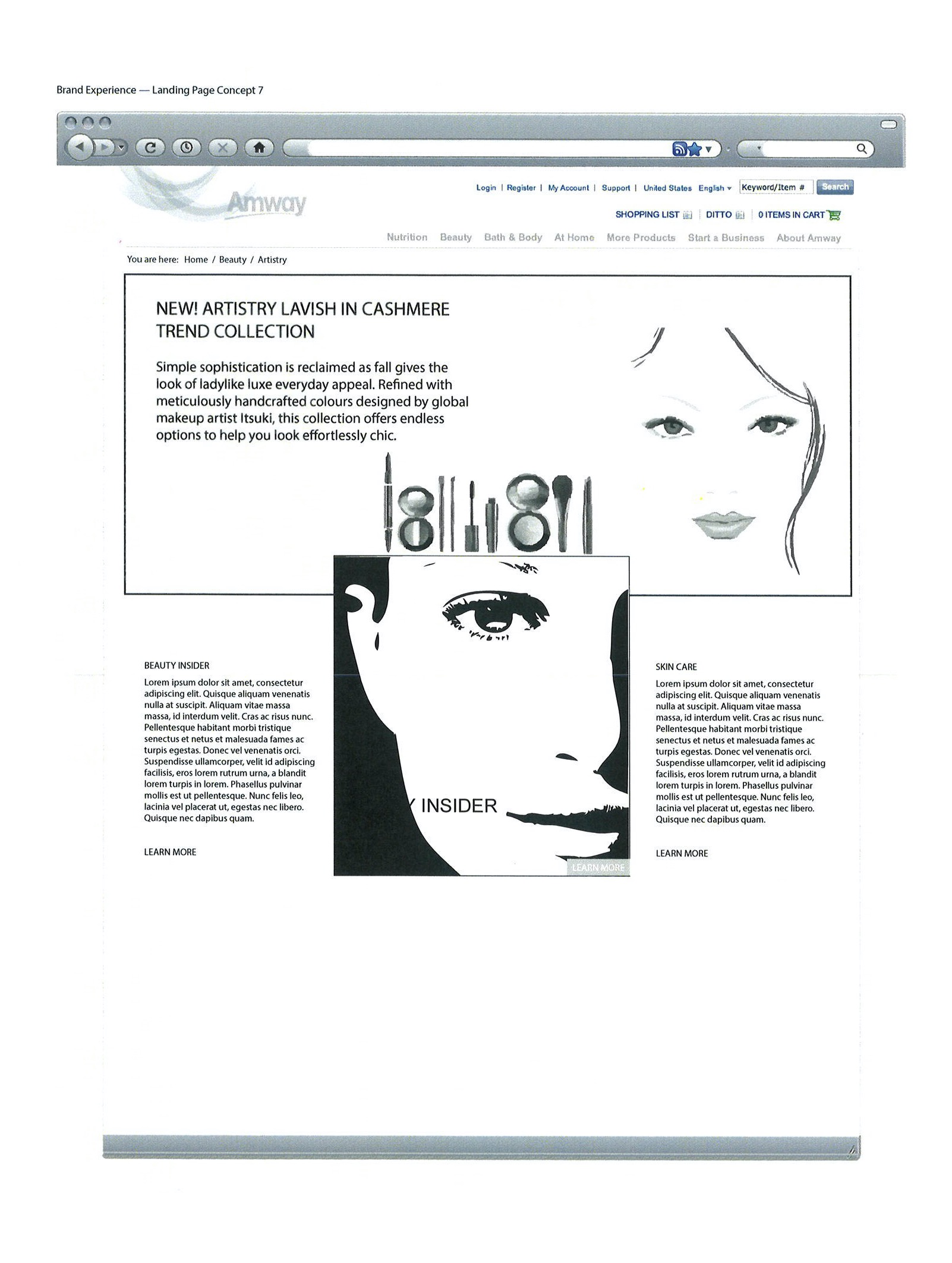
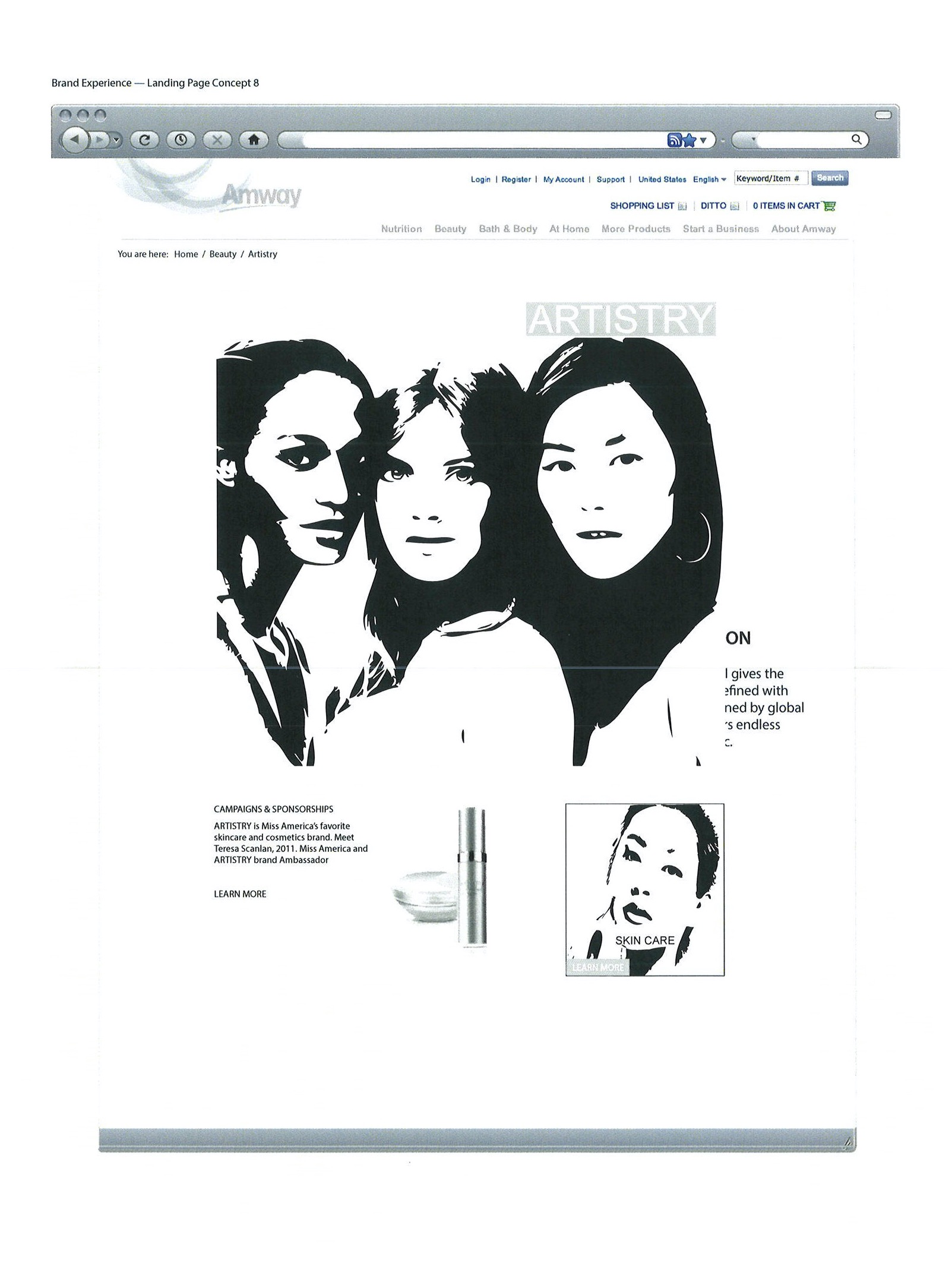
Artistry is Amway’s trendy women skincare brand. Across the various regions that market Artistry, a new more innovative display approach was mandated by product marketing. Individuals across the global region met for a one-day ideation session where concepts were given the opportunity to show merit for further approval funding. The challenge was to correlate multiple program management concepts into an acceptable solution.
Solution/Results:
The implementation of a tiles/cards metaphor provided a content connection to real-life objects. This usage provided a better way to gather various pieces of information to form one coherent piece of content. The concept design offered a traditional magazine layout with images and content copy to advertise Artisty product. Imagery elevates site or app design, because images draw the user’s eye effectively and immediately to the content. Employing images makes card-based design more attractive to users.
Typography & Visual Color Pattern:
Artistry Beauty:
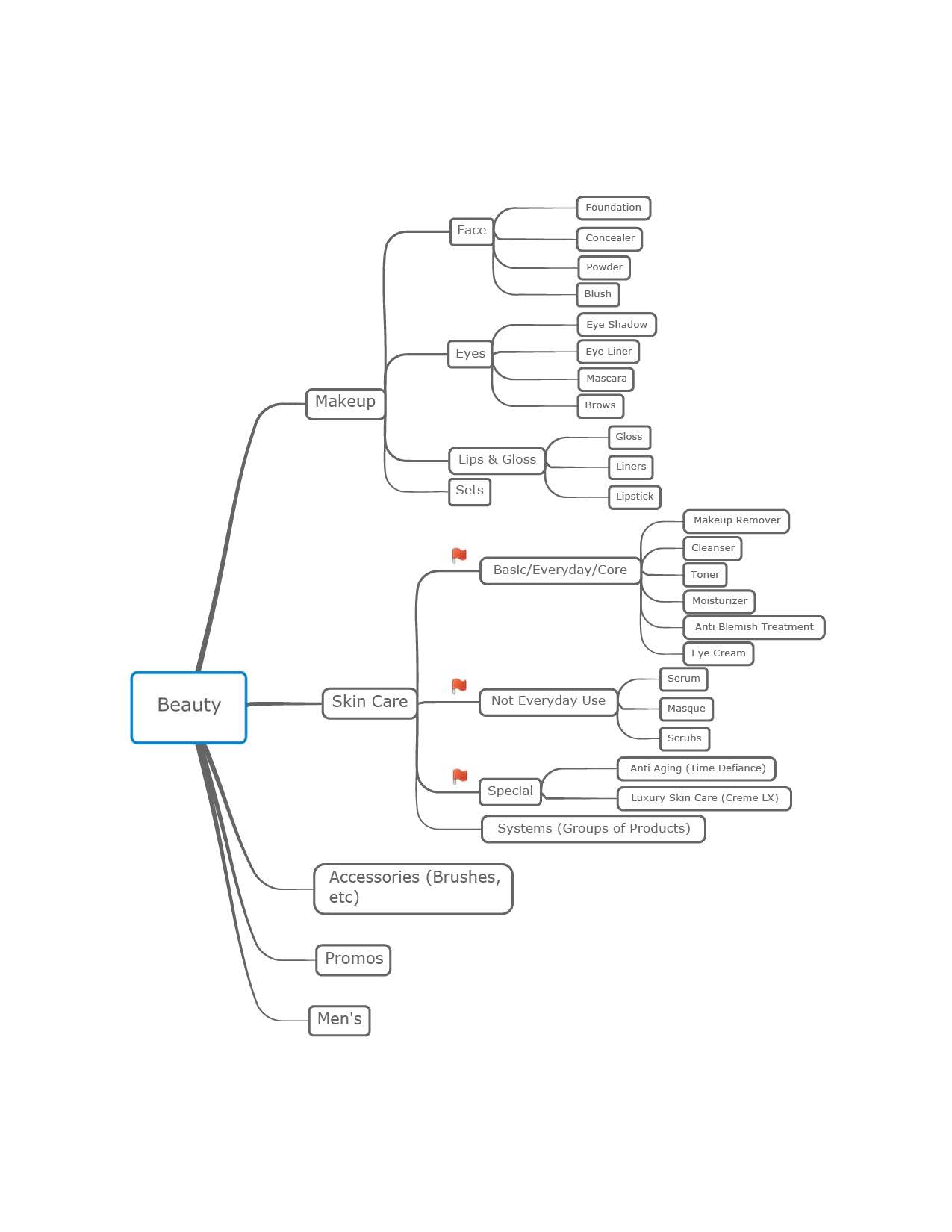
The basis for the Artistry design began with the creation of mind maps to organize regional marketing difference. Several white-board discussions outlined the proposition for a working theory. Also, card-sorting exercises produced an order that resonated with most participants thinking on effective grouping metrics. It should be noted that the card sorting technique in the test group generated a dendrogram or folksonomy. This was useful for designing the information architecture, workflows, menu structure, and navigation paths.
The strategy of Artisty functional level navigation was based on understanding how to engage the product with female customers. It had to display the allure of beauty, that every woman believes to be their attraction and Artistry is a top five premium skin-care brand. This was the goal in the design-thinking sessions where Artistry skin-care technology could leverage other key elements of a prestige-beauty brand, such as packaging that is distinctive and recognizable. Much like an invisible hand presented in a global face mission statement.
The above visual layout provides an innovative design thinking on a push-and-pull of product level importance. These views are rapid low-fidelity presentation concepts that evolved into the Artistry release cycle.
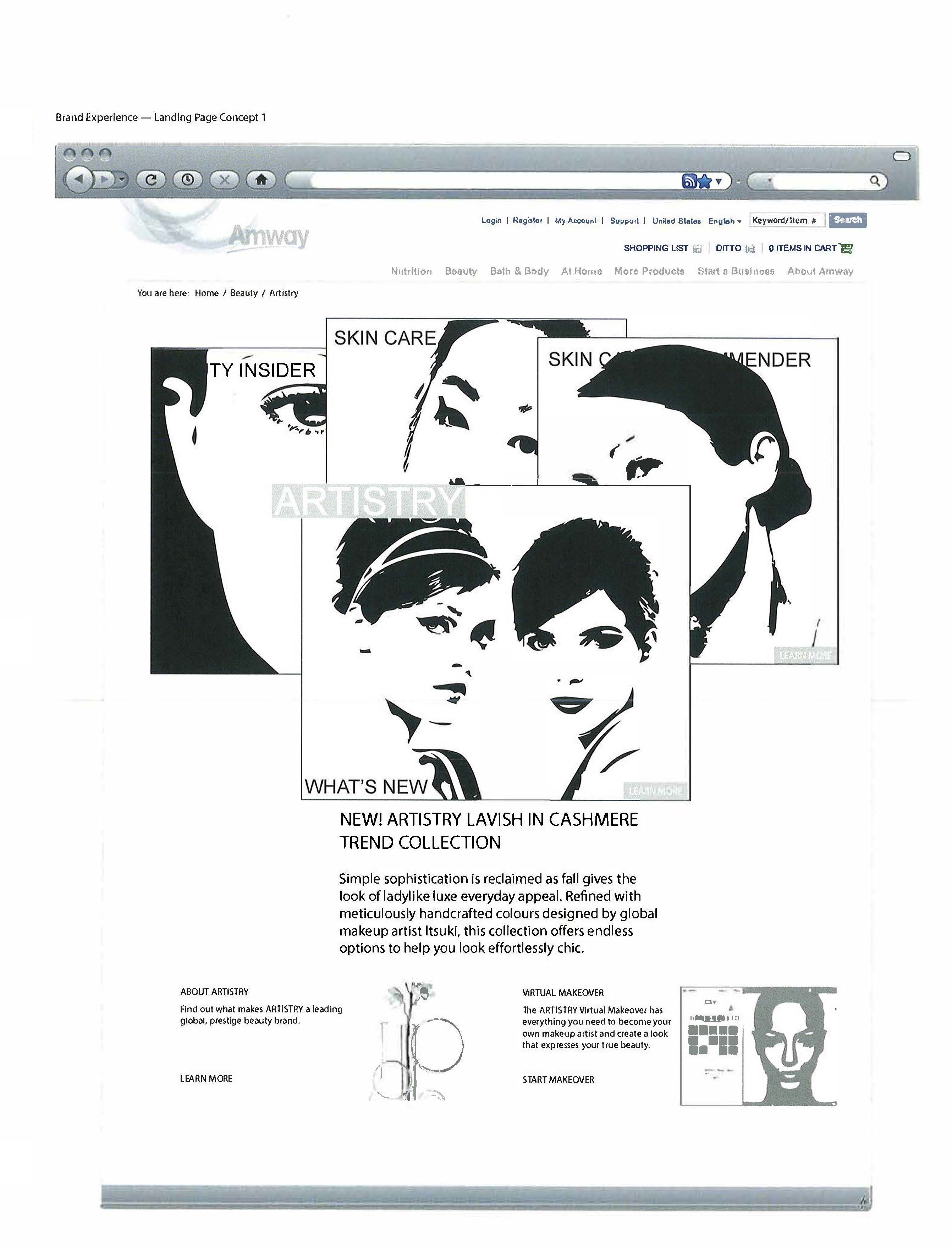
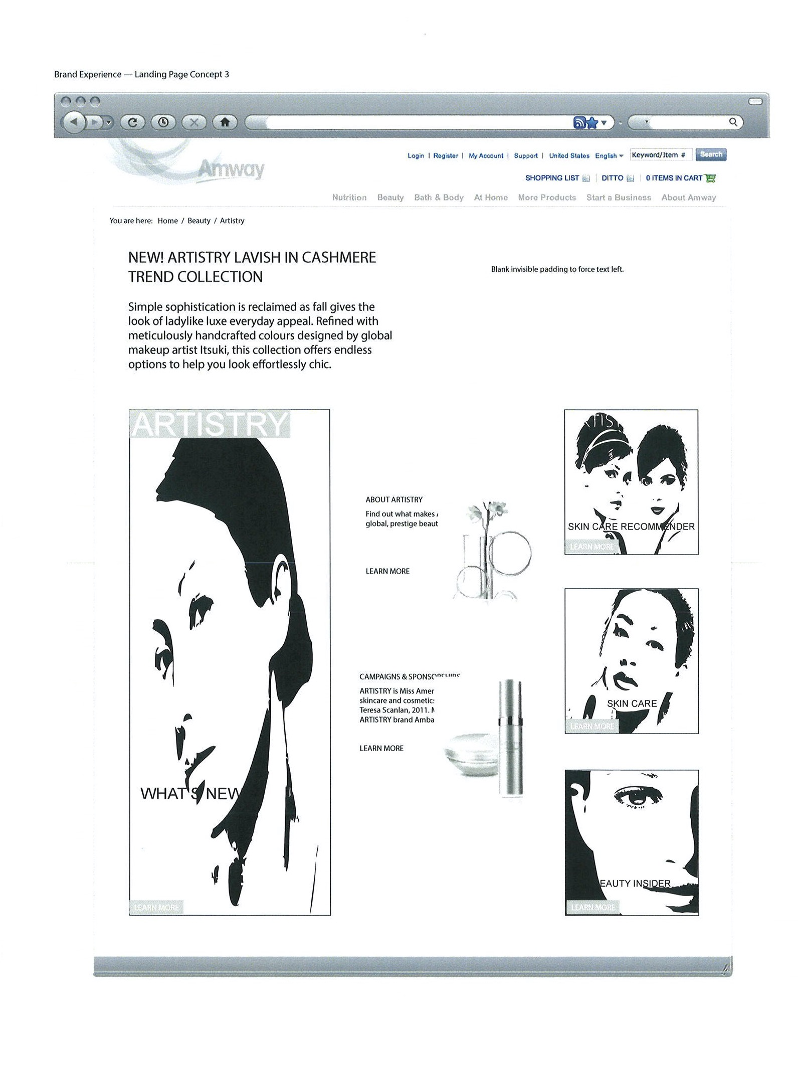
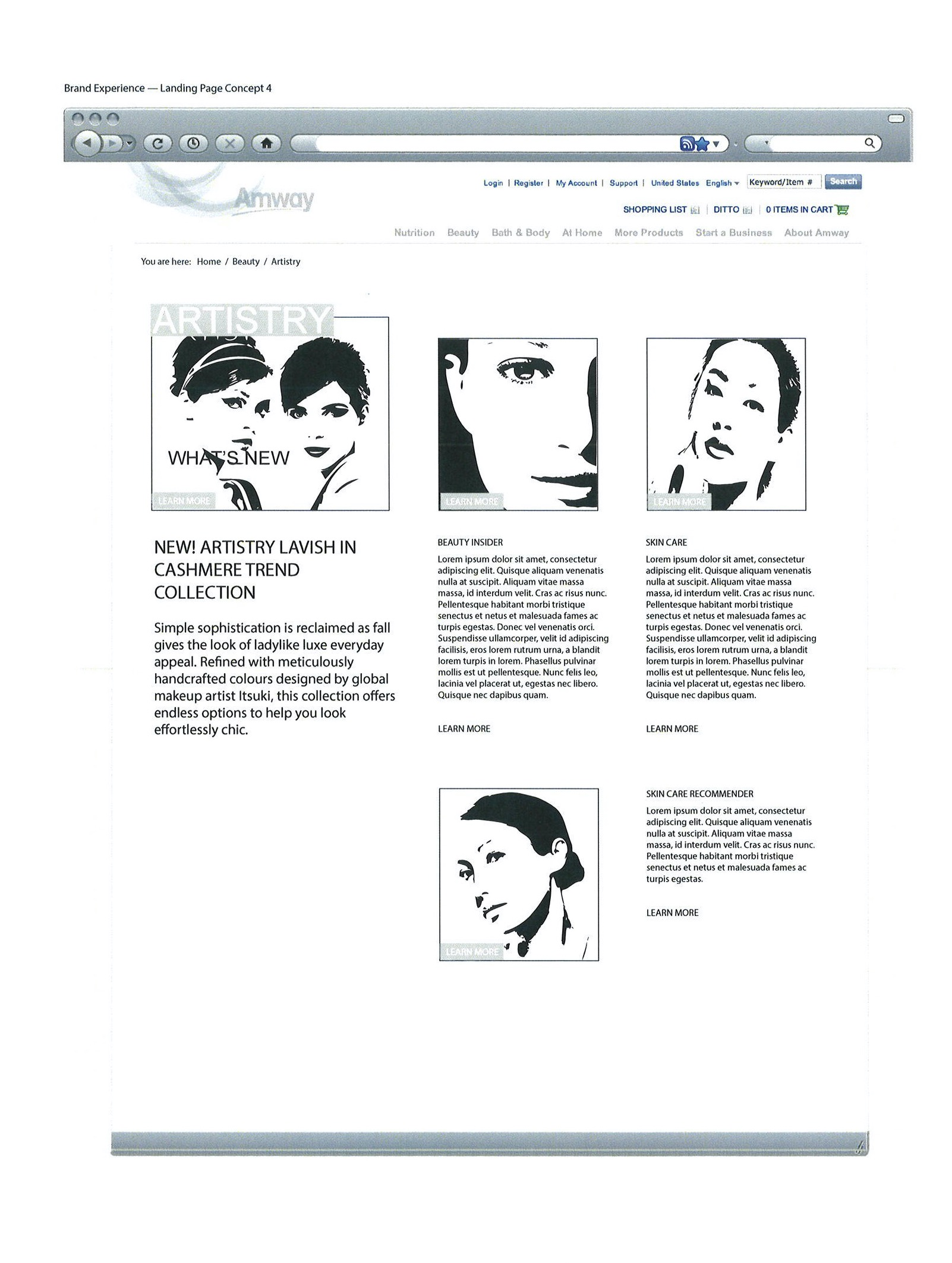
Once again page content arrangement of imagery provided product management the opportunity to evaluate brand cosmetic face makeup recognition in multiple formats. The absence of color in the design allowed participants to focus their conversations on tactical decisions.